The New Rams Logo: It’s Bad And Nobody Likes It
Is it April already? The calendar says March 9th, but it’s got to be April 1st. Otherwise, this Rams’ logo story might actually be a real thing. And it seems that it is. The legitimacy has been confirmed by Yahoo! Sports NFL reporter Charles Robinson and the Rams trademarked the phrase on the side of the cap, “Time To Shine.”
So this #Rams new logo hat that leaked on Reddit is legitimate. That’s the new logo. Thoughts? pic.twitter.com/mTZMeseS2f
— Charles Robinson (@CharlesRobinson) March 8, 2020
What this logo means, in the long run, is still not clear. The only murmurs from the Rams head office was a meme from Anchorman posted to Twitter by COO Kevin Demoff. What is clear is about the new Rams logo is it’s bad and nobody likes it.
— Kevin Demoff (@kdemoff) March 9, 2020
Twitter blew up with hate for this logo. Which is like saying, “I sat in traffic on the 405.” But as fellow LAFB Network Rams contributor Chauncy Telese reminded us, if Twitter can fix Sonic the Hedgehog’s teeth, it can fix this fiasco. In the pre-twitter world, there is a precedence of a team foisting a logo change on its fan base, then rescinding once the fan base recoiled.
In 1991, the 49ers introduced a new helmet logo and San Franciscans made them aware of their disgust. 49ers PR assistant Al Barba told the SF Chronicle, “The phones keep ringing. People are saying the old logo was classier, that it meant San Francisco. I guess they basically don’t like it.” The logo was panned across the board and the new logo never saw the green grass of Candlestick Park.Much like the 49ers, the Rams are trying to fix something that isn’t broken. It’s worked for 72 years, why change it now? In 1948, the Rams became the first team EVER to have a design on their helmet when halfback Fred Gehrke painted the horns on the team’s helmets.
To put it bluntly, iconic teams don’t change because they don’t have to and furthermore because they shouldn’t. Green Bay, Chicago, Dallas, Pittsburgh: Never changed. Those logos are simple, classic and they mean something to the fans. This is as if Grandpa showed up to church in a Supreme hat and Yeezys.
The reason behind the change may have something to do with the impending move to Sofi stadium. There are good reasons to switch it up, but moving 7 miles south is not one of them. Heck, the Raiders have moved a combined 1,287 miles without changing a thing. They haven’t even changed how they play football.
Sticking LA on the helmet could be a way to tell Southern California, that the Rams are their team and they are here to stay. There are better ways to achieve that. Like, for instance, building a $5 billion stadium. Stan Kroenke might have already communicated that effectively. Also, it isn’t as if LA needs a team to have anything to do with LA to get behind them. We love the Lakers and, no, they aren’t named for the residents of Toluca Lake. From a design aesthetic and branding standpoint, it’s not a good logo. At first glance, it isn’t clear what it is. Is it a wave? Oh, yeah, I guess that’s a horn. Taken out of context, no one could tell you what the logo could be for. There isn’t anything about it that communicates football or the Rams.
For logos, the use of a font is tricky because the trends move quickly and this font already feels dated. Ultimately, it looks more like an AAF team logo than a substantial, reputable, NFL franchise. Also, just for the record “Time to Shine” sounds like the theme for a senior citizens dating app.
For some examples of some of the finest design and branding, click here.
Hopefully, the Rams muckety mucks will take the hint from fans and scrap this before it rears its ugly head. The good news, if this comes to reality, there will be plenty of our beloved Rams gear on sale in the fan store. Get it while it’s hot!

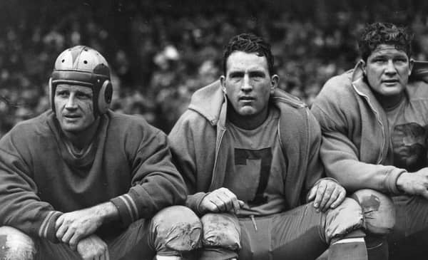
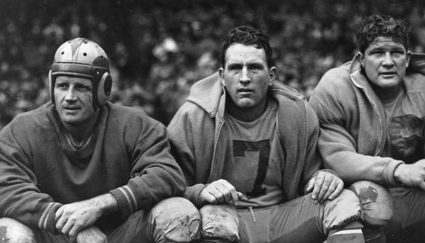
Jack Banta, Bob Watterfield, And Bob Hoffman Of The 1948 Los Angeles Rams. Photo Credit: Wikimedia Commons
